Friday 6 July 2012

Floating staircase by Zaha Hadid

This is a follow up post on the staircases. Since I published "the Amazing staircases" post few weeks ago I came across a number of interesting ones, even my friends started sending me staircases examples via Facebook. Thanks for that you guys! When I saw this one I immediately got a "deja vu" feeling. And then I realised what those shapes are similar to :)

Remember the Longchamps Store in Soho New York and its waterfall staircase? (link) Have a look at the floating staircase by Zaha Hadid, who by the way is one of my favourite architects out there. Do you see any similarity?  


Wednesday 4 July 2012

Small Budget Contemporary House by Pb Elemental Architects


After I published my last post on Grecia house Anna commented that it was not for ordinary people and that she wanted to see something more affordable. I appreciate all your comments a lot and take them very seriously so today to prove it I am presenting a much smaller house, contemporary and yet affordable.

It is called the Crockett Residence and was designed by Pb Elemental Architects (link). By looking at the pictures below you probably would never tell it has floor area of only 73m2 ( for those who use the imperial measuring system it is 790 ft2)! The house was built on a 149 m2 site (1600 ft2) and it replaced a small older home.  The architects managed to fit into such a relatively small space a foyer, an open-concept kitchen-living-dining area, four bedrooms, two baths, a utilities area, a large storage room and a secondary suite with a full kitchen, bath, laundry and closet. Topping it all off is a rooftop patio. Quite unbelievable! OK, there is no garage but the parking space is nearly fully covered plus apparently the owners commute mostly on bicycles so who needs a garage!:)  What is different to most of the houses that I have seen or lived in (with one exception) is that the "sleeping" part of the house has been designed at the ground floor, while the "day activity space" was situated at the first floor. Was this a good idea? There are probably advantages and drawbacks. The  designers' intent was to make use of the views and allow privacy without curtains and they certainly achieved that. But from my only experience of living in a house with such a setting I can tell you that carrying all the shopping numerous times a week to the kitchen at the first floor can be a bit uncomfortable...

Anyways I thought this house is fab and a great example what you can do with a small space. If any of you is planning on building a house or maybe designing one please feel free to get inspired.! You like?  


Saturday 30 June 2012

Grecia Contemporary House by Isay Weinfeld


I would like to introduce a bit of architecture to my blog. All in all this is really my field. As my first true contemporary architecture I would like to present to you this beautiful design by Isay Weinfeld. Grecia House  is located on a corner plot featuring 4.830 sq m in a residential area in São Paulo, Brazil. It was intended to be a house where the client could enjoy the company of his kids and many friends. For that purpose ample and various entertaining areas were designed and built, such as a cinema room, a recreation room for the children and a sauna. The house also features a large gym room and a long swimming lane.


'...From the main entrance, one approaches the house – set at the back of the land – by foot, up and through a wooded area, and across a wide garden. The house comes then fully to sight: 4 joined but distinct blocks, respectively covered with pebble-blasted concrete plaques (living quarters), exposed concrete (office), wood planks (entertaining area) and sand-blasted concrete plaques (dining and service areas).


A driveway set at the back of the house can be used by those arriving by car. Past a garage where the owner keeps his antique cars collection and up through a lush indoor garden, one comes to the main floor, where all living and entertaining areas are to find – except for the gym and recreation rooms, located on the lower floor, and the sauna, on the basement.
The location of the house was also defined by (huge) existing trees. An important part of the concept, the decision to build small patios and gardens around them allows for broad natural light and ventilation inside the house, helping to keep temperature cool and pleasant green views whichever way one looks at...." (link)


I must say this is right up my street simple, spacious and bright. The contemporary feel I suspect not many regular people could afford cinema room, sauna, gym and pool but this is a project to get inspired by. Those clean lines can be translated into smaller projects as well. Do you like?


Tuesday 26 June 2012

38 by Omer Arbel


Here is an interesting creation that I have mixed feelings about. It is simply called 38 and is a close cousin of a Canadian designer Omar Arbel for a contemporary design and manufacturing house Bocci. This is a  modern lighting design collection comprising of large glass spheres using the technique whereby air is pushed in and out of glass that is intermittently heated and cooled.A multitude of white cavities are introduced into the spheres randomly, intentionally intersecting and colliding with each other. Some cavities contain earth and plantings, others are used as housings for lighting elements. There are two or three lighting elements per large sphere, and one or two planters. Electricity and suspension are achieved using stiff copper tubing, which is allowed to  tangle and crinkle, seemingly without regard for gravity. Once in a while, these copper tubes loop around moon white planters, appearing to have escaped from the confines of the lit clear glass spheres.


I think it looks fab and kind of looks like an indoor jungle thanks to its randomness. Also it is hard to find an interesting idea for plant holders but I have one problem with this fixture- it is the plant watering. I can tell the plants have their own glass cavities (which is very clever) and there is probably no way the water could leak inside. But I have been always taught to keep the electricity away from any potential source of water so naturally I cringe just at the thought of live plant and a light fitting in one. 


38 from Bocci on Vimeo.

Friday 22 June 2012

Cool paint drip table by John Nouanesing

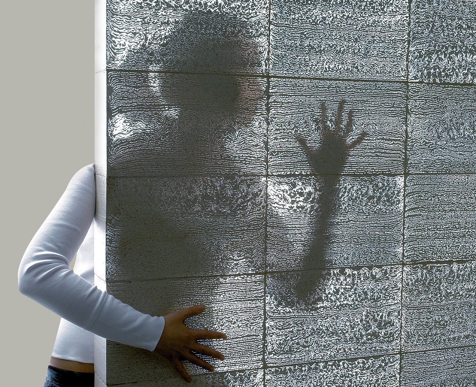
I love finding gems like the one below- the stuff that makes you think- this is really cool, I wish I could come up with something like this. Here we go: the table has a very original name: “Paint or Die But Love Me” and is creation of John Nouanesing who's has much more interesting stuff on his website here.
The colour is very suggestive.. which points me in my conclusions to this that this supposed to be blood... How romantic!:)
Somehow to me it it more funny than grim creation. Anyways it almost seem to defy gravity.. I don't think it is being sold anywhere yet but as a conceptual project  it is quite inspirational. What do you think? Would you buy one for your wife/husband/girlfriend/boyfriend ?


Sunday 17 June 2012

Semi-transparent concrete

For all those who are planning to renovate their houses or ever design or build  on their own- I would like to present to you this exciting material that will definitely add the WOW factor to every interior. I would like to say it is cutting edge but surprisingly it has been on the market for a good few years.The idea was developed by a Hungarian architect Aron Losonczi. The product, called Litracon (link), is a combination of optical fiber and fine concrete. Due to the small size of the fibres, they blend into concrete becoming a component of the material like small pieces of aggregate. In this manner, the result is not only two materials - glass in concrete - mixed, but a third, new material, which is homogeneous in its inner structure and on its main surfaces as well.  The material is produced as handmade prefabricated building blocks with each block having  exceptional and individual pattern of light. It even comes in a few different colours!


Sunday 10 June 2012

Street Art by Sainer from Etam Crew - On Urban Forms Foundation in Lodz, Poland

I am watching Ireland vs Croatia game right now and I to be honest with you it is too hard to watch! Go on Ireland!:) Trying to divert my attention from it a little bit otherwise I am gonna get a heart attack. I've been surfing the Internet so and just found this amazing Street Art created by Sainer from Etam Crew in Lodz (Poland) link! To all those who don't know Poland too well- plaster is a common finish there and it gets grey and dull with time. There have been many attempts to make the sad view (mostly) of 70ties architecture a bit more colourful- some great, some bad. I absolutely love this one- do u?


Monday 4 June 2012

Amazing staircases

Long long time ago there was a student of architecture. When the time arrived, the student started working on her biggest project ever- the dissertation. The project involved designing a Fine Arts Academy. The student thought hard and decided to make a staircase the feature of the building, to sculpt it in such a way to embody the artistic nature and the purpose of the place. I was that student:) The dissertation was finished and I graduated and yet today, years on I still keep on thinking how I could have done it better. So yes, I like a good staircase! Here are a few interesting ones. Enjoy. And maybe you have something to share?


Longchamps Store , Soho, NY link


Lello Bookshop, Portugal link 


KPMG in Munich designed by Olafur Eliasson link 


Liben, Prague designed by HSH link 


Thursday 31 May 2012

Posters by Mieczyslaw Gorowski

I was visiting my friend's house today for the first time when I came across a very interesting poster hanging on the wall. It amazed me also to learn that the author of the poster is Polish- like myself. I was not familiar with his works before! After coming back home I have googled Mieczyslaw Gorowski and found out a whole collection of fantastic graphics by this artist who regrettably passed away last year. These posters take surrealism to a different level. Check them out yourself. Is it something you'd like to have on your wall?


www.artportal.hu
source: www.jardindespirit.forumgratuit.org

source: www.jardindespirit.forumgratuit.org

source: www.jardindespirit.forumgratuit.org
source: www.poster.pl

source: www.theartofposter.com

Tuesday 29 May 2012

Tetris Furniture by Pedro Machado

The first piece I would like to share with you has been recently presented during Milan Design Week in April 2012 and was designed by Lisbon-based designer Pedro Machado. It was inspired by the Tetris game, so popular in the 80-ties and 90-ties which I played it as a kid myself! By rotating falling puzzle pieces (Tetriminos) by 90 degrees and moving them sideways, a player is supposed to create a horizontal line of ten blocks without gaps. Pedro Machado has taken this idea and created a piece of furniture that allows the user to create a personalised function for himself. The furniture takes a form of a many puzzle pieces put together, which can be pulled to shape a different form each time. Two square blocks pulled  together with a flat surface on top become a table with 2 chairs, while other pieces are drawers and will be perfect for storing personal items.


I must say I like the idea of an interactive piece of furniture, something that is changeable. The furniture is also advertised as a solution for small spaces.  Not sure how well it would look in a cramped room though...


To be honest I really love that piece but I have some reservations. What happens if those Tetris pieces are pulled out daily- is the polished white MDF durable enough? Is it stable? On the images the table piece seem to be hanging out from the sideboard. If a heavy item is placed on top of it will the sideboard fall? 


There is no mention of the price anywhere online, but the furniture can be ordered through designer's website .